Yes the climate changes.
It has ZERO to do with CO2 @400 ppm
That big fucking yellow thing in the sky might just have some affect
——/
Chris Martz
I'll explain this to ya like you're five. So, turn your ears on and put your five-finger sausage tuggers down.
It's my turn to talk. It's your turn to listen.
Let's continue. . .
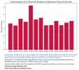
The chart I plotted on the left shows the annual mean number of heatwave days (HWDs) per decade since the 1890s at all NOAA USHCNd stations with at least 100-years of daily temperature data. ️
. - .
Notice I put the text above in for you. I did that so you wouldn't miss it. I'm always looking out for you buddy o' pal. Don't sweat it.
Keep that in the back of your mind.
Oh, and silly me, I almost forgot. . .
Here, I defined a HWD the number of days per year at a given station with a daily maximum temperature that is equal to or exceeds the 90th percentile for that day relative to 1961-1990 climatology for, at a minimum, three consecutive days [as per World Meteorological Organization standards].
Was any of that confusing?
Are we on the same page?
I hope so. I'm on page 69. Isn't that nice?
Let's move on. . .
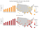
Now, the chart you linked to shows the annual average number of heatwaves per decade since the 1960s and it consists of data taken from 50 large U.S. cities, most of which are shown to be located in the eastern third of the CONUS and along the west coast.
Now, if you're smarter than a toothpick, there are two glaring problems with the data you presented. Let's see if you can figure it out all on your own first. This is a good mental exercise.
I smell smoke.
Were you thinking too hard again?
Someone call the woo woo bus.
sirens
Let's put out that brain fart. Pshhhh.
Alright. Well, you tried.
See, the two problems with your attempt of a rebuttal are:
➊ The data I presented begins in 1891. The data that you presented from the U.S. Global Change Research Program arbitrarily selects 1961 as the starting date. That's what you call cherry-picking.
➋ The data I presented was compiled from over 800 USHCNd stations with at least a century of data. The chart you presented was created using temperature data from 50 large U.S. cities that are compromised by urban heat island (UHI) effects which increasingly give artificially high readings.
No serious scientist would use the data you presented to make a point about climate [change].
But, since this was featured in the latest U.S. National Climate Assessment (NCA5), it is clear that some of the scientists or bureaucrats involved in writing this report were a few French fries short of a Happy Meal.
Hope that clarifies any confusion you might have.


